How Essex Crossing Hopes to Attract Tenants With Prebuilt Suites
The flexible designs spread over two floors of the project
By Rebecca Baird-Remba March 12, 2024 9:00 am
reprints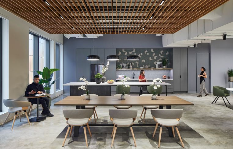
The developers of the Lower East Side’s Essex Crossing megaproject are building out two floors in hopes of attracting new tenants.
Taconic Partners, L+M Development, The Prusik Group, Goldman Sachs Urban Investment Group and BFC Partners tapped M Moser Associates to design the new floors of prebuilt suites at 145 Delancey Street, one of two office properties in Essex Crossing. Construction started in January 2023 and consists of 7,000 square feet on the second floor and 21,000 square feet on the third. It was largely finished by the following July.
The work at 145 Delancey wrapped before news broke in December 2023 that Verizon would be putting 143,000 square feet of office space at neighboring 155 Delancey up for sublease, a move that highlighted the struggles Essex Crossing has had in drawing office tenants. The telecom giant originally inked the deal in 2021 with the aim of relocating its staff from the Ralph Walker-designed telephone switching building at 140 West Street, but that never happened, and the 155 Delancey space has never been occupied (nor has it been filled since Verizon’s decision).
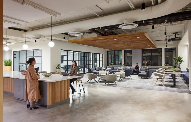
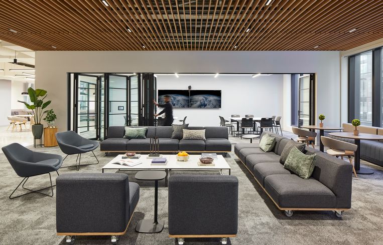
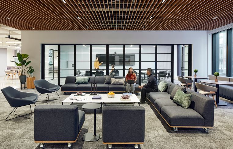
The design of the 145 Delancey prebuilts is neutral and modern, and aims to be adaptable for a wide range of tenants. The second floor is an amenity space with a pantry and a large lounge area, which can be connected to a long conference room using a series of retractable glass doors. The couches and chairs in the lounge area are designed to be reconfigured for large meetings, either on casters so they can be rolled into place or lightweight enough for one person to pick up and move.
In terms of more fixed furniture, there are bench seats along two walls paired with round, wooden cafe tables and midcentury-
inspired, light gray upholstered office chairs. Most of the seating is a basic, upholstered dark gray. A suspended set of wooden slats line the ceilings in the lounge and pantry areas, both for sound attenuation and as a nod to a wood slat wall in the lobby.
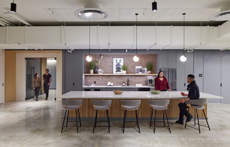
The kitchens offer some more creative design elements. One in a third-floor office space that features a backsplash made of tiles that look like brick, to which is attached a long wooden shelf adorned with framed abstract art, black-and-white photos, and potted plants. Suspended globe lamps provide light, and the kitchen island is lined with rounded, wooden posts and topped with a long slab of white marble.
All of the built-in cabinetry is painted a light gray. Another office has a backsplash composed of gray, hexagonal tiles, with white tiles sprinkled in to create a geometric pattern. The counter-height seats are dark green, in a rare splash of color.
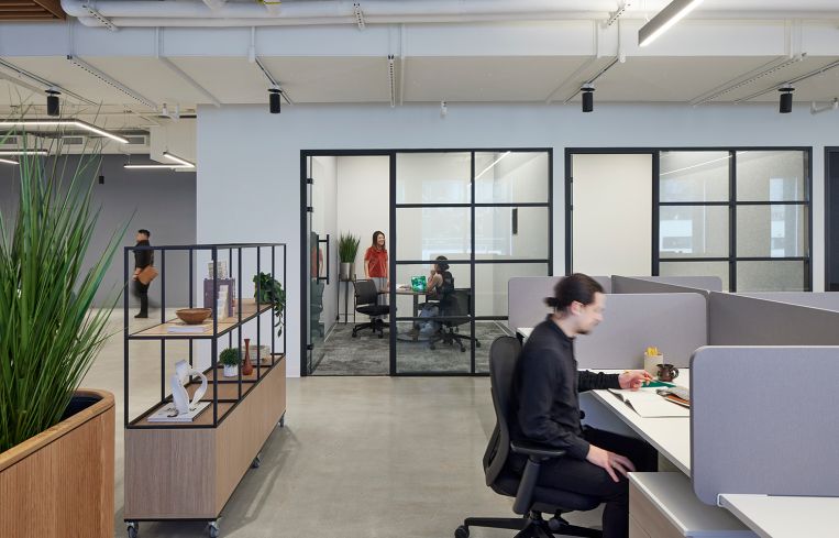
The third-floor office layouts are fairly traditional yet flexible, with a mix of small, glassed-in conference rooms and open workstations. There are movable shelves with small sculptures and plants, making it easy for companies to come in and rearrange the furniture for their preferred layout.
“The aim was to be future-proofed, modern and timeless using natural materials,” said Chris Swartout of M Moser, the architect who oversaw the project. “We’re leaving the palette open for potential tenants to come in and make it their own home. There are areas that are left open to imagination. There are renderings and other design items we’ve produced, to show a potential tenant.”
Rebecca Baird-Remba can be reached at rbairdremba@commercialobserver.com.
CORRECTION: This story has been updated to reflect that the 155 Delancey space is still leased to Verizon.


