Presented By: Jamestown
How Spec Suites Can Be as Inspiring as a Designed Office Space

While the thought of spec suites may not bring to mind creatively-designed, inspirational spaces, the thought shifts when they’re brought to us by the developer of the Innovation and Design Building, Industry City, and Ghirardelli Square.
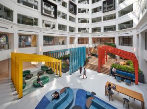
For its Ballston Exchange, LEED-Silver office property in Arlington, Virginia, Jamestown just unveiled seven spec office suites of varying sizes and designs intended to inspire those who work there.
The suites, ranging from 2,551-4,123 square feet on the building’s third floor, follow a recent redesign of Ballston Exchange that includes the addition of new amenity spaces. These include a Conference, a fitness center with private locker rooms and showers and CorePower Yoga. Retail tenants at Ballston Exchange include CAVA, Philz Coffee, We, The Pizza, MyEyeDr. and Shake Shack. In 2021, the property will welcome new tenants including Hawkers, Farmbird and El Rey.
The suites were designed in partnership with the Washington, DC-based architecture and interior design firm Hickok Cole, which was charged with designing the suites to integrate with the amenity space.
“The idea was to create spec suites filled with tenants who would be drawn to that common area on the first floor, to activate the area and bring a sense of community into the building,” said Amy Shavelson, Co-Director of Interior Design for Hickok Cole.

The firm took many of its cues from Jamestown’s current branding, expanding on Ballston Exchange’s visual presence.
“Jamestown had put together this lovely palette that was in all of their marketing materials, and also in the lobbies and common areas,” said Coleen O’Leary, Staff Interior Designer at Hickok Cole. “We were charged with creating seven unique suites on one floor with their own character and flavor. We were thinking, how do you create something bold and still appeal to a wide array of potential tenants. We decided that by creating seven very different palettes, if you didn’t like suite number one, maybe you’d still like suite number six.”
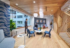
The building’s design is focused around soft primary colors, with reds, blues, greens, and yellows that were slightly desaturated. Hickok Cole built off of that and placed variations throughout the new suites.
“Throughout the space, there’s a blue, a lighter version of that blue, of kind of gold/yellow color, a soft red, and then a jade green, and those are used in different variations in all the finishes,” said O’Leary. “So where we have accent paints we used those colors, and then we used bold, really graphic wall coverings and things like that that pull off of those soft primary colors.”
The suites have several features designed to appeal to tenants of indeterminate duration.
“We had to design broadly enough where it fit the needs of several different types of users,” said Liza Plunkett, project interior designer for Hickok Cole. “We looked at workstation configurations, whether it was benching stations or traditional workstation cubes. We looked at flexibility – could anyone come in with a variety of furniture and use the space? We built the office on standard sizing, like 10 x 10s or 9 x 10s, so they are appropriately sized for someone that could be there for 10 years for when their company grows. But also, these suites give tenants more than they get in standard flex suites. We had fun with fabrics. We had fun with finishes, with lighting. We incorporated a lot of decorative elements you’re not getting in a standard spec suite.”
So while the suites may have been intended as short-term spaces, they were designed to appeal to occupiers for the long haul if necessary, with design touches beyond what one might normally find in a short-term flex space.
“These spaces could be occupied by a tenant for 10 years if they chose to do so,” said Shavelson. “We have customized, wooden doors for each office, far beyond the standardized doors we often install in offices. There are added touches and features, and an extra level of TLC, detailed thinking, and investment that Jamestown was willing to make in the suites in order to make them appealing to tenants.”
To that end, while the size of the suites makes them appropriate for new or smaller companies, there are mechanisms in place to allow some tenants to expand. Two pairs of suites are combinable for tenants that desire a larger space than the current footprints allow.
“We did that by creating continuity through the finishes,” said O’Leary. “The two paired suites have the same carpet, so if you took out the demising wall and opened the suites up to each other, there wouldn’t be totally different finishes or carpets. You would have continuity. We space-planned for that and made sure there was a wall that didn’t have plumbing or anything on it.”

Continuing the theme, the suites are filled with the sorts of caring details one wouldn’t expect to find in spec suites.
“One hidden detail I love about this project is that all of the built-in banquette seats have storage drawers underneath,” O’Leary said. “Everyone was very excited about that because when you only have 3,000 or 4,000 square feet, you really need to maximize storage.”
“The doors are solid core wood doors,” adds Plunkett. “They wanted a patterning to them and we were thinking, this is going to get really expensive. But we worked with our contractor and our mill worker to keep the cost down.”
The overall effect is a series of suites that will do what spec suites rarely accomplish – they will feel like home.
“Oftentimes when you’re charged with designing spec suites, there’s this balance between creating something that’s compelling aesthetically, but also that any tenant can walk into and feel like they can make theirs,” Shavelson said. “Nobody wants to walk into a completely white and beige space. But if you walk into a space where the colors are too strong, it might be difficult to say, I see my brand here. The goal was to walk a line between creating something that felt dynamic, that felt like it had energy, and still felt broad enough that a group could see an ability to make it their own without feeling like it spoke too much to a brand that wasn’t theirs to begin with.”


