The Plan: A New 22-Story Mixed-Use Tower Joins a Historic Bank in Williamsburg
By Rebecca Baird-Remba May 31, 2017 7:21 pm
reprints
The historic Dime Savings Bank of Williamsburgh is about to get a facelift and a 22-story, mixed-use tower next door, designed by the distinctly modern architects at Fogarty Finger.
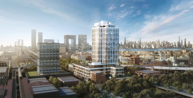
The South Williamsburg project at 263 South 5th Street is unique because it includes a large office component spanning 100,000 square feet, 50,000 square feet of retail, the century-old Neo-Classical bank building and 177 rental apartments. And it will rise in a fairly high-profile spot between South 4th and South 5th Streets, right next to the ramp to the Williamsburg Bridge, the Brooklyn-Queens Expressway and the elevated subway tracks.
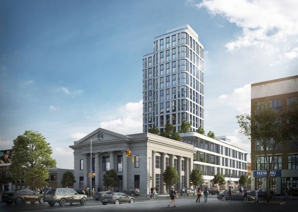
Charney Construction & Development and Tavros Capital Partners are developing the 340,000-square-foot project, which will be called “The Dime.” The pair purchased the 50,000-square-foot site from Dime Community Bancshares for $80 million in March of 2016, including the air rights above the bank, which added roughly 48,000 square feet to the planned development. The bank’s headquarters at the corner of South 5th and Havemeyer Streets was not included in that sale, but the developers told Commercial Observer that they are in contract to purchase the bank building for an undisclosed amount. They intend to close on the property in a few months, after the bank relocates across the street to The Williams, a recently completed rental building at 282 South 5th Street.
“We always wanted the bank building,” said Sam Charney, principal at Charney Construction. “It had been the icon for the Dime Savings Bank of Williamsburgh. They were hesitant to sell it in general; they really felt like it was part of their identity. Once they realized we were a partner that wanted to honor that history, they came around [to selling it]. We think it adds a tremendous amount of value to the project.”
The developers tapped 1 Oak Contracting to oversee construction, which is slated to commence in June and wrap up in the third quarter of 2019.
The new building will be clad in terra cotta panels, which are an unusual departure from today’s typical fiberglass or metal façade panels. But the painted ceramic tiles became a popular building material in the late 19th and early 20th centuries because they’re durable, easy to mold and cheap. The architects chose terra cotta for the new structure in order to link it, historically, with the 109-year-old bank.
“We got inspired to use terra cotta by researching the architect [of the Dime Savings Bank],” explained Chris Fogarty, a partner at Fogarty Finger. Helmle & Huberty designed the 1908 limestone structure, and the firm was also responsible for the iconic Prospect Park Boathouse, which is covered in bright white terra cotta.
“So it was tying back to the bank building, but the idea that the bank building and what we were using for the new building are materials that were used at the same time,” Fogarty said. He drew particular inspiration from a large, white terra cotta loft building at 475 10th Avenue at the corner of West 35th Street in Hell’s Kitchen, as well as from the Starrett-Lehigh Building at 601 West 26th Street on the western edge of Chelsea.
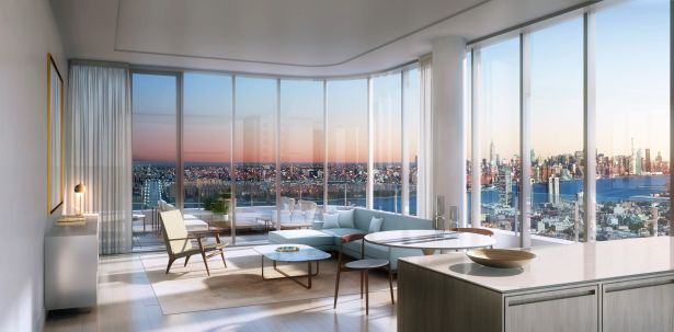
After five stories of ground-floor retail and offices, the property will set back into a slimmer residential tower. The setback will create a roof deck with an acre of outdoor space landscaped by Grain Collective, featuring an inclined outdoor lawn, gardens where tenants can grow their own produce, Ping-Pong and pool tables as well as grills. Residents will also have access to a basketball court, a yoga room, a library and a gym on the fifth floor, plus a rooftop lounge on the 22nd floor and a 300-car subterranean garage.
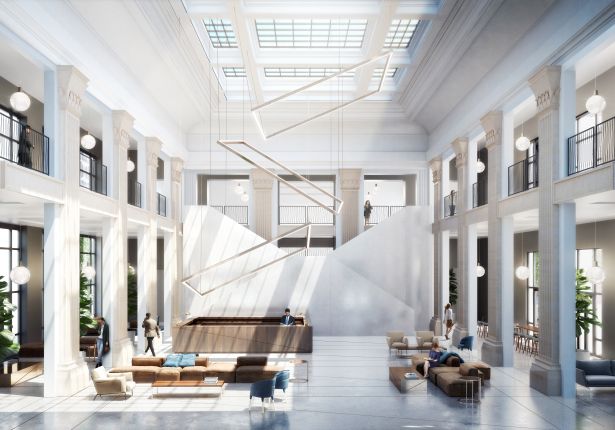
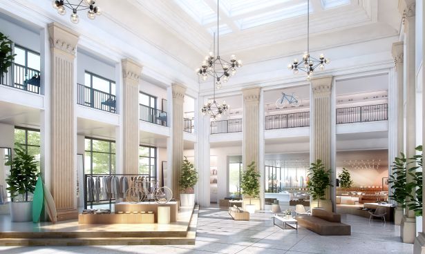
The restoration of the 16,700-square-foot bank building will involve removing 1960s-era finishes and drop ceilings, sprucing up the existing columns, and replacing an old pitched roof skylight with a new, larger one.
The bank could become a lobby for office tenants or a retailer, Fogarty said, and the renovation will depend on who takes the space. Windows could be added or removed based on what the tenant wants, and the building could either remain separate or be connected to the new complex.
The development is meant to cater to the growing number of office tenants who want space in Williamsburg, where there are few new office projects under construction. The building will offer three floors of office space in its base, with large floor plates and 13-foot-ceilings.
“Office tenants don’t want the old-fashioned drop ceiling and carpet,” Fogarty said. “They’re looking for open-plan space. One of the things we’re able to do here because the residential building is concrete, we’re able to do the entire building out of concrete, almost column free. We’re able to create these large 30,000-square-foot floor plates that the market is desperate for.”
The offices also make the ground floor more attractive to retail tenants, who might be hesitant to move into set up shop in an area where customers are only around in the early mornings and evenings.
“When we talk to retailers, they don’t want to be in a place where there’s not a lot of daytime foot traffic,” Charney said. “[By putting in office space], you’ve created an office market, and you’ve created daytime foot traffic that will help those retailers thrive.”
Update: This post has been updated to correct the square footages of office, retail and outdoor space in the project, and to include the details of the sale of the bank building. Comment from the developers has also been added.


