Inside Macmillan’s New Downtown Headquarters at 120 Broadway
By Rebecca Baird-Remba October 15, 2019 4:03 pm
reprints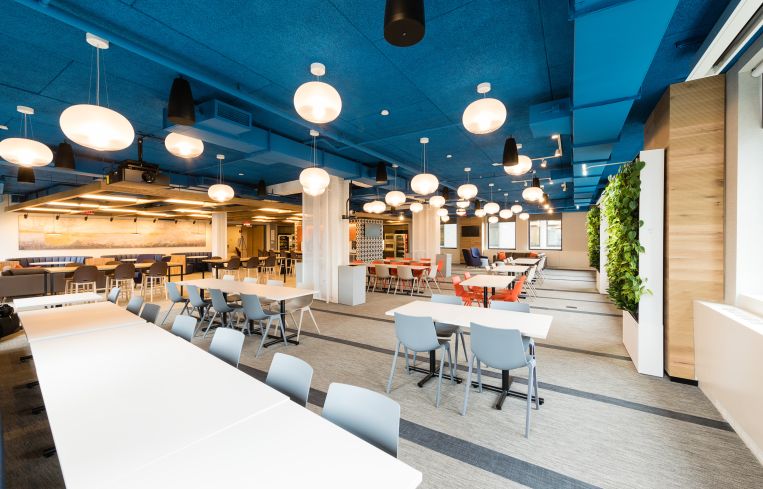
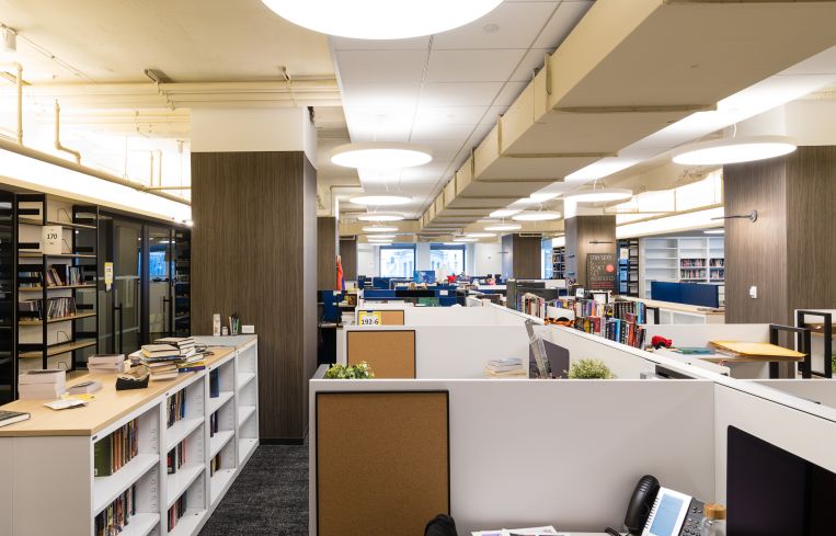
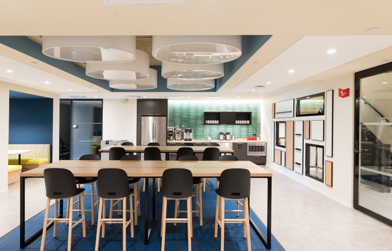
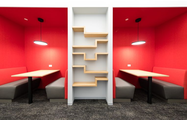
After 60 years as the sole tenant in the Flatiron Building, Macmillan Publishers left the historic but sorely outdated property for new offices in Silverstein’s 120 Broadway, also known as the Equitable Building.
Although the 40-story Equitable Building was built in 1915, only a decade after the Flatiron Building, Silverstein recently pumped millions of dollars of capital improvements and renovations into the Financial District office tower. The 1.8-million-square-foot structure between Pine and Cedar Streets also offers much larger contiguous floor plates than the triangular Flatiron Building. Equitable’s two connected towers allowed Macmillan to consolidate what had been 21 floors of narrow space on 23rd Street into just five floors in 120 Broadway. The 176-year-old publishing firm also combined three separate offices into one as part of its move downtown, where more than 1,000 employees now fill 260,000 square feet.
Macmillan built out separate offices for each of its imprints, including Farrar, Straus & Giroux, as well as its audio and children’s publishing groups. Designed by TPG Architecture, each of the offices has a similar look but was designed with slightly different neutral color palettes that include black, grey and brown. The audio arm also has two recording studios. There is also a separate kitchen for each division, for a total of nine pantries scattered throughout Macmillan’s space. And all five floors are linked by a central staircase where the walls are splashed with paintings of books and manuscripts.
“We have multiple publishing companies, and each one of these companies kind of has their own culture and identity,” explained Andrew Weber, Macmillan’s chief operating officer. “We wanted them to reflect that in their space, but we also wanted a space that was coherent overall. So, we tried to balance having a common design with letting them have individual personalities, and I feel like we were able to pull that off.”
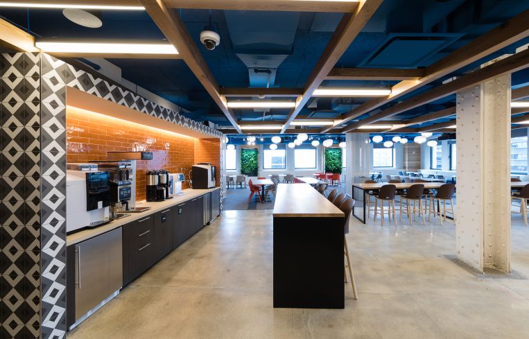
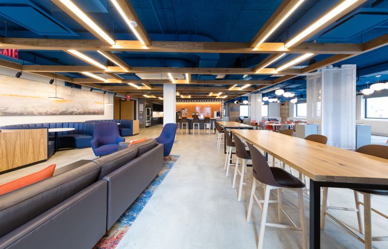
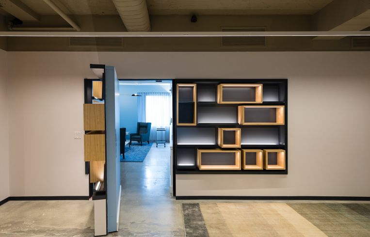
But the most colorful part of Macmillan’s new office is undoubtedly the 25th floor, where it has a brightly lit reception area with white walls and a large, curated wall of books on floating shelves. The floor also has a few large conference rooms, smaller meeting rooms and phone booths, and a hidden sitting room behind a bookcase that caters to visiting authors and small meetings. A huge dining hall at the northern end features an exposed ceiling that’s been painted royal blue, an open kitchen with seltzer and espresso machines, hanging plant walls, one long wall dominated by a gray and yellow abstract painting, and a variety of tables, booths and couches.
Weber added that they replaced the formerly covered upper portions of the windows — known as transoms — with glass throughout the office, in an effort to bring more light into the space. The office also has an open layout with glass-walled offices and conference rooms.
“We wanted a lot of light and air and transparency, promoting collaboration and informal interactions,” Weber said.


