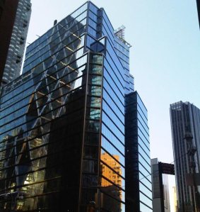
3 Columbus Circle: Luxurious or Lipstick on a Pig?
By Matt Chaban November 22, 2010 6:28 pm
reprints Columbus Circle has been the victim of bad architecture for decades, since Robert Moses built the Coliseum on its western flank in the 1950s, a building derided at the time as “utterly pedestrian,” among other epithets. It has since been replaced by the far nicer though not always beloved Time Warner Center. Just across Broadway is the banal Trump International.
Then there was 2 Columbus Circle, the Edward Durrell Stone-designed museum for eccentric heir Huntington Hartford, an odd palazo that Ada Louise Huxtable dubbed the “lollipop building.” Love it or hate it, the building erupted into controversy last decade, when the Museum of Art and Design took it over and replaced the facade 
with one by Portland architect Brad Cloepfil. That might have met a nicer reception were it not for the giant hello hidden in its exterior.
Now comes the latest controversy, over 3 Columbus Circle, a building formerly known as 1775 Broadway that is not actually located on the roundabout but behind the museum. Bought by Joseph Moinian early last decade, his firm undertook a $100 million refurbishment of the project in 2008, which involved glassing over the facade of what was once known as the GM Building, when it was built in the 1920s.
Because much of the original art deco masonry was left in place, and the new glass curtain wall was simply slapped in front, the building has come in for criticism from the blogosphere, architecture critics and even a very powerful neighbor trying to take the building over and possibly tear it down.
Today, The Journal penned an apologia of sorts for the renovations, talking with the architect responsible for the project, Peter Wang. Among the challenges facing him:
For one, he was dealing with a building that dates to the mid-1920s, which means the structure had myriad built-in challenges, like low ceilings and forests of columns. Further, because there were financial and structural limitations, he couldn’t strip the facade down to its steel girders and replace the masonry with a glass one. Rather, Mr. Wang had to snap a glass facade onto the existing one-something that becomes readily apparent in the evening, when the glass becomes transparent, and the old masonry peeks out from underneath.
“It was determined that the brick facade of this building actually performed a very important structural function,” Mr. Wang says. “So it would have been very difficult to remove the old facade entirely, because new curtain wall glass systems are not designed structurally.”
The article invokes both the terms “lipstick on a pig” and “a huge chunk of glass,” the latter of which is at least meant as a compliment. It is true the building was no wonder before, and in certain terms the renovations could be considered an improvement. So, dear reader, The Observer is wondering, which is it? Thumbs up or down in the comments, please.


