How a NoMad Apartment Building Remade Itself During the Pandemic
By Rebecca Baird-Remba June 8, 2022 6:13 am
reprints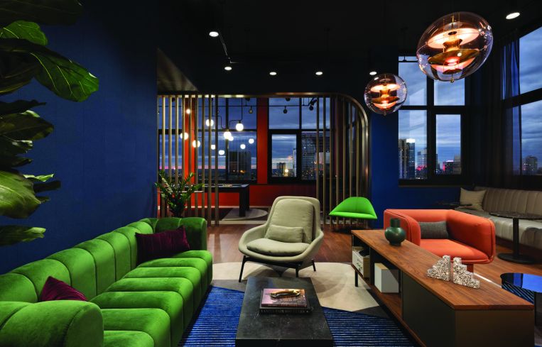
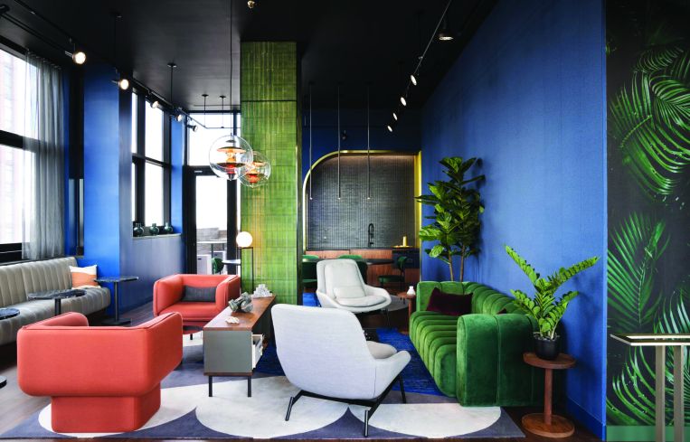
Designing residential amenities at a luxury building in Manhattan during the height of the pandemic was no easy task. Wealthier New Yorkers were leaving the city in droves, and the ones who stayed were mostly working from home and needed space to spread out.
Global Holdings Management purchased the Instrata Nomad at 10 East 29th Street for $380 million in February 2020, just before the pandemic upended Manhattan’s rental market. The following month, as the novel coronavirus swept across the city, Global Holdings’ designer and its architect, Fogarty Finger, scrambled to adjust designs and construction timelines to the new reality.
Originally built in 1999, the 50-story, 392-unit building — where one-bedrooms now start at more than $5,000 a month — needed more than a few renovations. So Global Holdings began slowly updating the apartments as tenants vacated, renovating the basement, first floor and roof deck. Work began in late 2020 and wrapped up in May. Along with a rebranding to Anagram Nomad, the renovation involved moving the fitness center from the first floor to the basement, a double-height space that once housed a large boiler. The new fitness center includes a climbing wall, a yoga studio, a pilates studio, cardio equipment and weights.
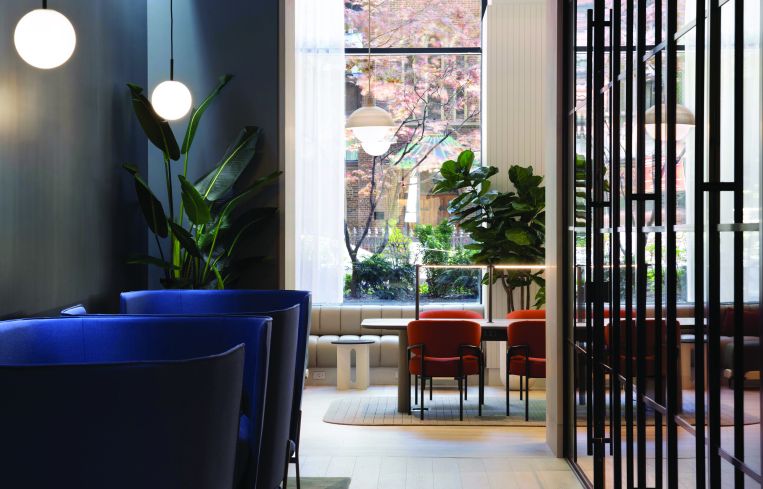
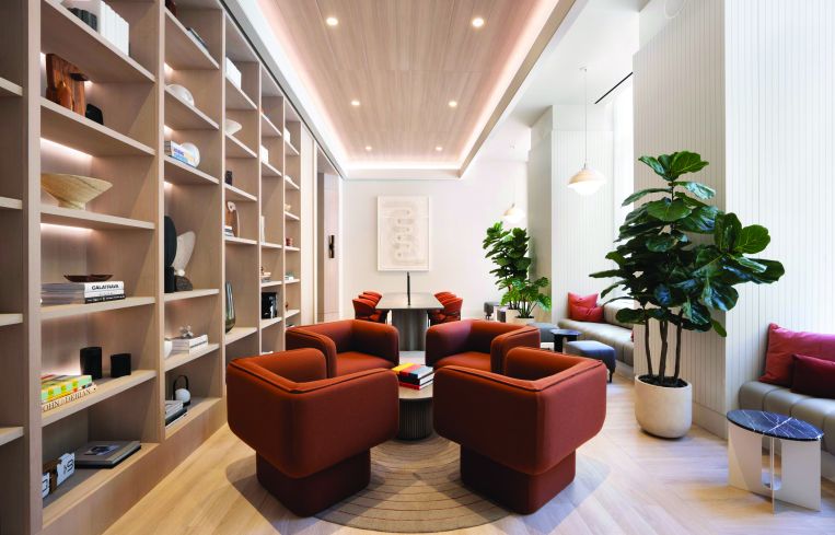
The vacant ground-floor space was turned into a library, coworking space, a children’s playroom and a coffee shop. Maria Figueira, vice president of design and development at Global Holdings, said the design team developed a color blocking scheme for each room — blue for the coworking space, yellow for the gym, red for the library, green for the cafe. Yet much of the library and cafe are outfitted in light woods, which are meant to be soothing, with the seating providing the color palette.
“Yellow is meant to feel more active and remind you that you’re there to exercise,” said Figueira. “The library is a sophisticated maroon and red color palette. A very wide corridor has become a coworking space, with a conference room and two telephone rooms. It’s a calming blue, which tells you that this is a heads-down concentration space.”
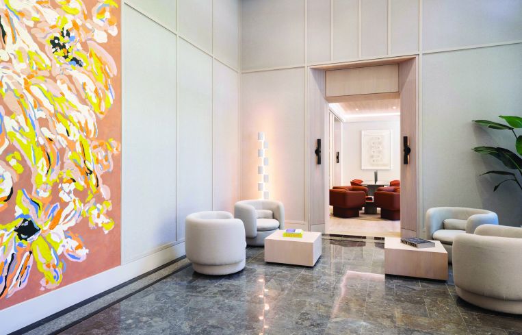
The updates also include new art in the lobby from gallery Uprise Art, which placed a large abstract painting of flowers in front of the entrance. The property’s existing roof deck got a revamp, too, with new seating, hammocks and grills, plus an adjacent indoor party room.
“The main goal of the whole project was really to elevate the existing tenant experience both physically and mentally,” said Ashley O’Neill, an architect at Fogarty Finger who worked on the project. “We removed the oil tanker from underneath the parking ramp, and we found this amazing space in the basement. On the ground floor we wanted to create more of a sense of arrival, like your apartment starts at the actual door of the building. The everyday experience was done in a more sophisticated, neutral palette.”
Rebecca Baird-Remba can be reached at rbairdremba@commercialobserver.com.


