The Ace Hotel Debuts in Downtown Brooklyn
By Rebecca Baird-Remba September 15, 2021 10:00 am
reprints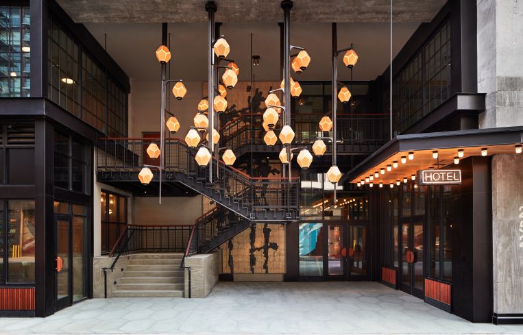
The Ace Hotel was an early forerunner of the boutique hotel trend, with three friends — Alex Calderwood, Wade Wiegel and Doug Herrick — opening its first location in a former boarding house for sailors in Seattle in 1999. After expanding to Portland, Ore., and Palm Springs, Calif., the company opened its first New York City outpost at 29th Street and Broadway in NoMad in 2010.
So it’s only natural that the newest Ace would come to Brooklyn. The 13-story, 287-room hotel opened last month at 252 Schermerhorn Street, between Bond and Nevins streets in Downtown Brooklyn. The project was constructed directly on top of the Hoyt-Schermerhorn subway station, and required special engineering to prevent noise and vibrations from affecting guest rooms. The building’s architect, Stonehill Taylor, worked with structural engineers to help distribute the building’s horizontal load on the one-third of the site that’s not on top of the subway.
“You can bear on the station vertically, but you can’t bear on it horizontally, like the earthquake forces,” said Paul Taylor, a partner at Stonehill Taylor. “There’s a little triangle on Bond Street that’s barely bigger than a townhouse where we had to transfer that load.”
He explained that because they were unable to build a cellar beneath the building, the development team — led by GFI Development — managed to secure a 40 percent floor area bonus from the city’s Board of Standards and Appeals.
In terms of design, designers Roman and Williams wanted to give the building an industrial feel, in keeping with Ace’s hipster brand. The facade is cast concrete, with large, warehouse-style windows that are just shy of floor-to-ceiling. There is even a column of smaller, portico windows, perhaps in a nod to the history of Ace’s original Seattle building. The slightly Brutalist look — complete with a big, exposed concrete column running up the eastern side — doesn’t seem particularly out of place on a block that also includes a new Holiday Inn, a luxury rental building, an office building for the state Department of Labor, and a Goodwill store.
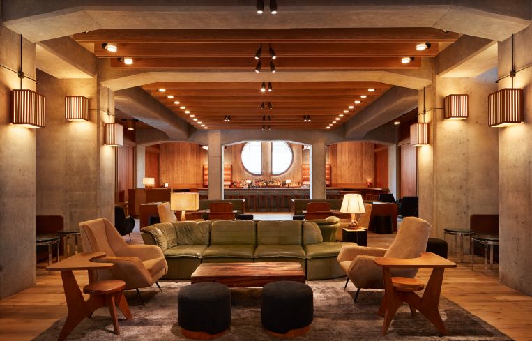
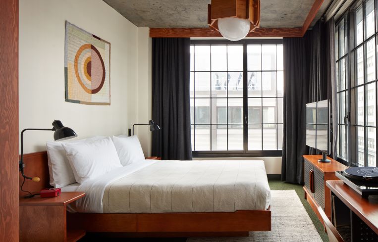
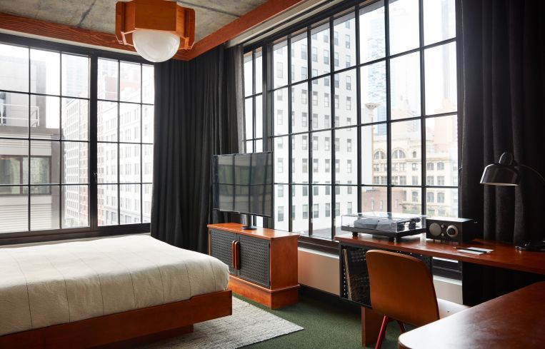
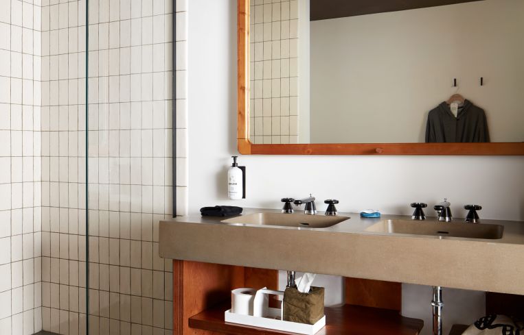
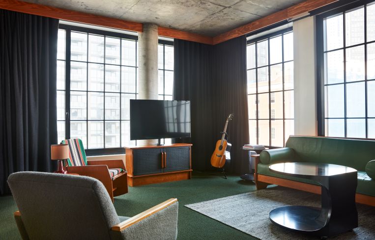
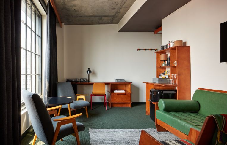
Roman and Williams also handled the interiors, and the look is certainly more mature than the mid-2000s look of Ace’s NoMad hotel. The ground-floor restaurant and bar features warm wood walls and wooden, midcentury modern tables to match green, leather-upholstered dining chairs and a large, abstract wall mosaic in green, yellow and red geometric shapes. Upstairs, the guest rooms have exposed concrete walls, warm wood finishes and furniture, including midcentury coffee tables, chairs and couches upholstered in greens and blues.
“The Ace brand is really all about taking some old, grungy building and renovating it,” said Taylor. “To give a soul to a new building is kind of difficult. That’s not what the Ace is about. It’s hard to create a new building that can have a sense of being renovated. It has sort of a Brutalist aspect to it, with the raw concrete outside and inside. The guest rooms have concrete ceilings and you have these big braces.”
Rebecca Baird-Remba can be reached at rbairdremba@commercialobserver.com.
Update: This story has been updated to reflect the fact that Roman and Williams handled the facade design, not Stonehill Taylor.


