5 Bryant Park Gets Clean Redesign With Restored 1950s Mural
By Rebecca Baird-Remba February 2, 2021 3:27 pm
reprints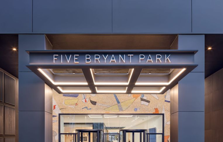
When Savanna hired Fogarty Finger to renovate the lobby of 5 Bryant Park, the architecture firm immediately decided that they needed to preserve and highlight a midcentury mural by Max Spivak that had been obscured beneath a false front across the entrance.
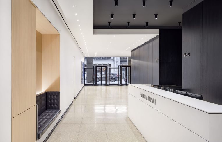
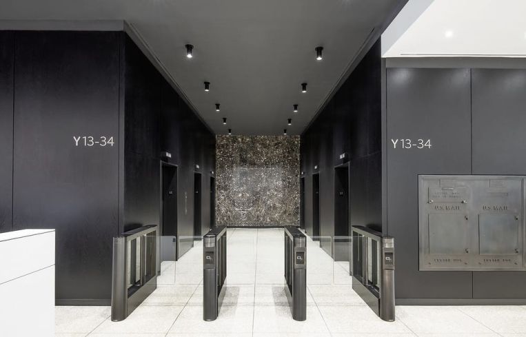
They created a dramatic, new black frame around the vestibule and added lighting. Then, for the lobby itself, the firm opted for a simple, black-and-white color scheme that would help showcase a series of paintings along one wall. A stained black oak was put in along the walls and ceiling by the elevator, along with a new white reception desk and white plaster floors and ceilings for the rest of the space.
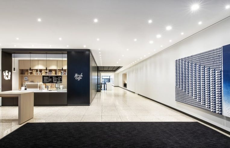
The black wall with the elevator bank also extends to include a new coffee bar operated by Birch Coffee, along with a blonde, high wooden table for people to stand at after they’ve gotten their drinks.
“The goal of the lobby was not to do dramatic changes to it, but to rework the materials in a way that would accommodate an art gallery,” said Robert Finger, one of the founding partners at Fogarty Finger. The lobby walls feature a series of gridded, blue-and-white paintings by abstract artist Matt Mignanelli.
On the top floor, Fogarty Finger also worked on a new marketing center for the 34-story tower, which was originally built in 1957. The aim was to help sell the narrow, 5,000-square-foot tower floors in the building to financial services tenants who would pay $100-plus per square foot.
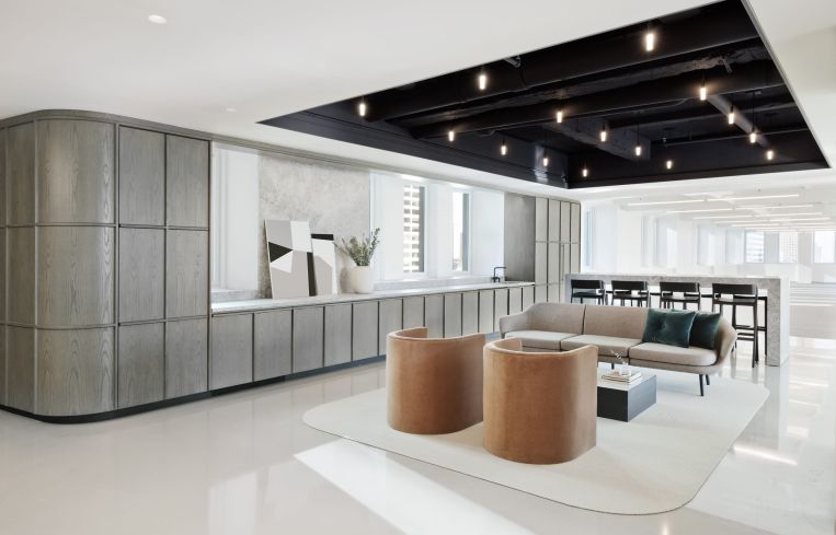
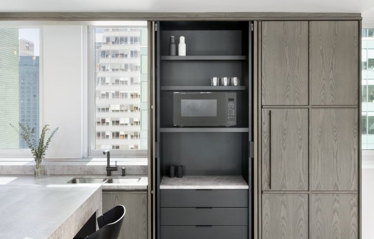
Finger said his design team aimed for “a monolithic look, but still warm” with the marketing center, which is a small pre-built office suite. A long, floor-to-ceiling gray cabinet — made of European ash wood and veneer — lines one wall. It has curved corners, and parts of it slide open to reveal pantry storage, a fridge and cabinets, and a cut-out portion includes a sink and faucet.
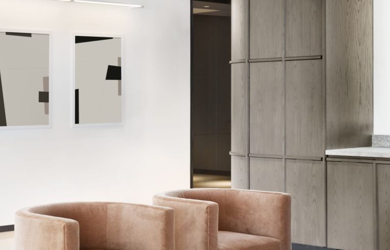
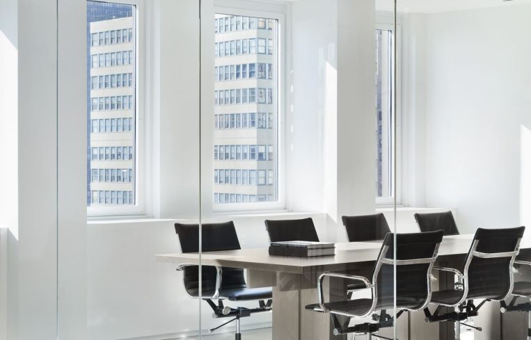
Midcentury orange modern chairs and a gray couch round out the sitting area, along with a high, white marble-look table and black chairs. There’s also a small conference room with a boardroom table, enclosed in rounded glass.
“We decided to make the color palette derivative of the fall and winter in the park below,” said Finger, referring to the grays, whites and oranges. “And we did the transparent conference room to showcase the views and light that come in.”


