Fortune Magazine Gets Trendy New Offices
By Rebecca Baird-Remba March 28, 2020 4:55 pm
reprints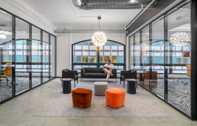
After Meredith Corporation sold Fortune magazine to a Thai business mogul, the magazine moved out of Time Inc.’s former headquarters at 225 Liberty Street last year and into 40 Fulton Street.
Fortune’s new landlord, Vornado Realty Trust, hired TPG Architecture to design a new space for the magazine, which is famous for its list of the 500 most profitable companies in the U.S. For the first time, Fortune was able to design its own office, rather than accepting the aesthetic of its longtime parent company, Time Inc. (Meredith acquired Time and Fortune magazines from Time Inc. in 2017 and ultimately sold them both, to different owners, in the fall of 2018.)
The business magazine’s leadership wanted its new offices to look high-end enough to host an interview with a Fortune 500 company exec but still embody the casual and hip vibe of a typical media company.
“It was really important to build that culture in their office and build that cohesiveness,” said Suzette Ferrier, the senior associate from TPG who oversaw the construction of Fortune’s new space. She added that the company “wanted to be able to play in the same ball field as top CEOs but also have their own feel.”
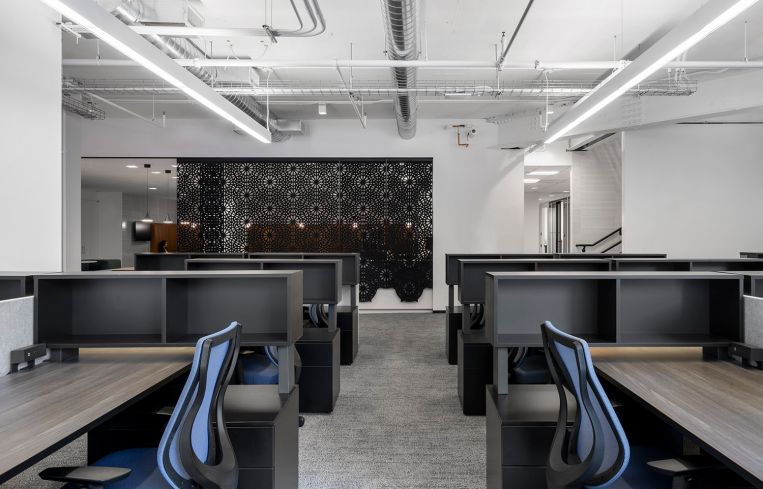
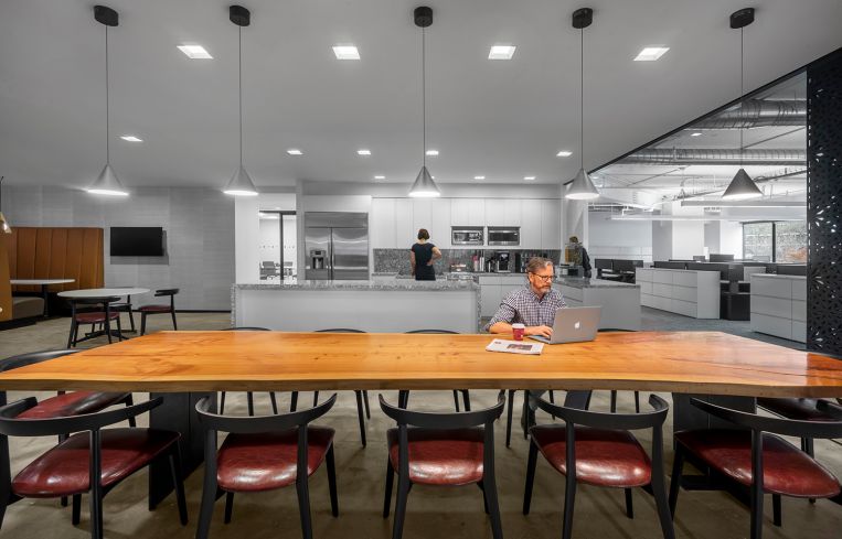
The architects decided to reduce waste by saving some aspects of the previous tenant’s offices, including a set of large circular booths that were reupholstered with tan leather and a long wooden table. Both items now anchor a large kitchen area with stainless steel appliances, white cabinetry, a long island and black-and-white-marble-clad counters and backsplash. The kitchen is separated from the open newsroom by hanging black, translucent pieces of felt cut in floral, geometric shapes. The panels can slide along a track on the ceiling and extend about three-quarters of the way to the floor. They allow workers to create a barrier — albeit a non-soundproof one — between the kitchen and the open newsroom during the work day, or to open up the kitchen to the rest of the office for an all-hands meeting.
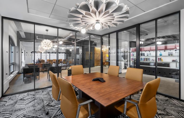
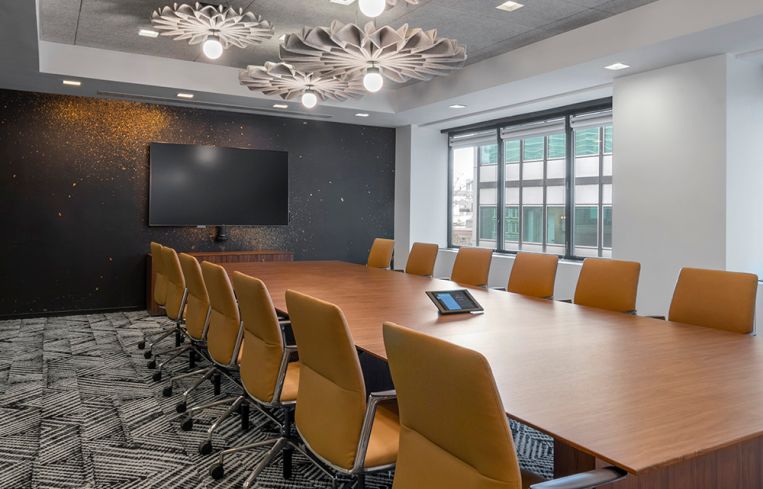
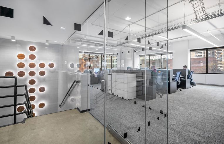
“They really look at what they do as the intersection of art and business, and they wanted to feel like they were the creative agency that they were,” explained Susan Pavlovsky, a TPG designer who worked on the project. So the architects brought in other trendy touches, including a vertical cluster of brown, flat, button-like wall sconces that light up an internal stairway, and flower-shaped felt light fixtures in a conference room to help absorb people’s voices.
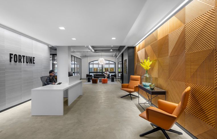
Other noteworthy aspects include a geographic patterned wooden wall in the reception area, which is emblazoned with the magazine’s name and hung with posters of Fortune’s most interesting covers over the years. Down the hall from the reception desk is a seating area with a black upholstered couch and two black armchairs, in front of one of the space’s unique, nearly floor-to-ceiling half-moon windows, with a chandelier made of Edison light bulbs hanging overhead.


