The Plan: Lester Schwab Katz & Dwyer
By Adrienne Gaffney February 18, 2015 12:15 pm
reprints

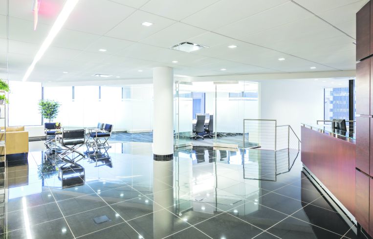
When law firm Lester Schwab Katz & Dwyer made the barely five block move from 120 Broadway to 100 Wall Street they took it upon themselves to adopt a radically new aesthetic for their two-floor, 40,000-square-foot space. The 40-year-old litigation firm turned to the Spector Group for an open-plan office that looks more Silicon Valley than big law.
“It’s a beautiful space for lawyers—who are not used to beautiful space,” said Spector Group principal Marc Spector.
“Their priority was to change the cultural perception of how they are perceived in the marketplace, and they wanted to use the architecture and branding of their new space to launch that,” explained Mr. Spector, who took his inspiration from the 26th and 27th floors’ 360-degree vistas. “100 Wall Street has got the most magnificent view shots. You’re either up in the clouds or you’re [looking at] just gorgeous views of Downtown and the East River,” he said. “You have unrivaled views on four sides of this building. It’s very rare that you have magnificent view shots from four sides of a building.” Spector wanted a clean and sparse design that would let the space’s natural features shine.

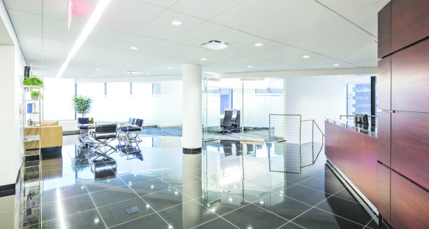
The resulting space was completed in November of last year. “You come in like, holy cow. Here I am. It’s a cool crisp modern interior. There’s not a lot of fluff. There’s not a lot of appliqué, not a lot of millwork, not a lot of moldings. It’s all about the views, and what we were able to do to create a transparent workspace,” said Mr. Spector. The design is a dramatic contrast to their prior space—Mr. Spector said that calling it black to white would be putting it mildly. “They were in a landmark space where it was all Corinthian columns and groin vaults and Gothic interior architecture. Enormous spaces, very dark, virtually no glass,” he explains.

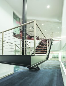
The star feature of Spector’s design is a floating staircase that connects the two floors. “We also wanted to create a greater vertical campus for them versus simply occupying the 26th and 27th floors,” he said. “We opened a big, beautiful stair on the perimeter wall. We opened up the whole reception area so when you walk into that space, it just feels monumental right away.”
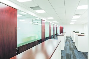
The firm’s visual element reflects greater changes happening from the ground. Spector helped usher a movement from a corner office dominated culture to one characterized by collaboration. “We reduced the size of the perimeter offices for the partners and associates and we reduced the footprint of the workstations for their paralegals but we didn’t diminish the quality of the workspace,” he said.
Mr. Spector emphasized community spaces as well as spots for privacy, when needed. Sound-proof telephone rooms located around the office allow workers the opportunity to take sensitive calls on their cell phones.
“If you create an environment where people are constantly together, they’re going to be more productive. The workstation environment, these cubicles are not really cubicles,” he explained. “There’s not the large five-foot barrier surrounding workstations where you’re creating privacy. They’re much more open to everyone else and that’s changed the work place. People are gathering around workstations where they weren’t before.”


