Pleased to Greet You: Exceptional Points of Entry
By Scott Spector November 4, 2013 6:00 am
reprintsLate last month, I had the pleasure of attending a ribbon-cutting for one of the most exciting projects in lower Manhattan’s recent history: the opening of the World Trade Center West Concourse connector to Brookfield Place. Pedestrians are delighted, because, since the attacks of Sept. 11, 2001, they have not had a comfortable passageway for their commute. The tens of thousands of people who circulate through the area daily now have a 600-foot-long, spacious, white-marble pedestrian passageway that can take them all the way from the PATH station to the ferry terminal and right into the Brookfield Place Pavilion. Soon enough, upscale retail will also be added to the mix.
As an architect, I’m rejoicing for an entirely different reason: The entry pavilion at Brookfield Place is a prime example of what a reception space should look like and one of the most exceptional lobby design sequences I’ve ever been a part of. While we served in the executive architect role, my hat tips to Pelli Clarke Pelli for designing the pavilion and to the entire Brookfield Properties project team who helped make that vision a reality. So what makes it so spectacular? The pavilion, which is at street level and underground, pushes the envelope with its jewel box structure and the way it’s so simply, yet elegantly, detailed. It features all of the “musts” for a great entry—tons of daylight, the use of sustainable materials, state-of-the-art finishes and technology, and a design that ties beautifully into the overall architecture of the complex.
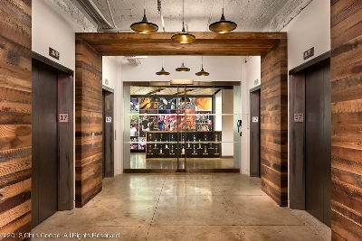
 However, great reception or lobby areas don’t always have to consist of an entire building to be memorable. We recently completed an updated and refreshed interior lobby for SL Green, at 600 Lexington Avenue, that was just as special in its own right. The end result was a sophisticated transitional space that boasted plenty of natural daylight and a modern, clean design that worked within the client’s proposed budget and was Class A all the way. The reception area and lobby serves as a front door for the skyscraper and an example of what can be done in the interiors of its upper floors. In fact, along with this project, we design prebuilt spaces for the landlord and several build-to-suits customized to its tenants. Each was inspired by the look of the reception area, mirroring the finishes and lighting used down below.
Taking that idea one step further, each tenant has the chance to make an impact with a reception area for their own office space. Right now, reception space trends are largely dictated by the type of business conducted in that office. For instance, many social media or technology firms do not even have a defined, formal reception area. Instead, visitors or clients might walk into a communal work area or a library space or be greeted by a group of people, some designated for this role and others that might just happen to be working there at the moment. These spaces, many tailored to start-ups, lack a formal desk, seating area and coat room. Perhaps there is a telephone on a door or you’re entering a gaming area. Or if it’s a product-driven company, you walk into a showroom displaying its goods and, in lieu of a “hello” from a receptionist, the person who mans the products welcomes you into the mix. As long as the reception space fits the culture of the company, it will work.
On the flip side, corporate entities, such as law firms, hedge funds and private equity firms, still favor the formality of a more traditional lobby and reception space. While they haven’t changed much in recent years, they have gotten slightly smaller due to more efficiency and the incorporation of technology.
So, what’s the bottom line? There are many different ways to “do it well” when it comes to lobby or reception space design. What you see when you first set foot in a space sets the tone, whether it’s for a large project, an office building or a company’s individual office space. The same principles of smart design—good lighting, quality finishes, sharp aesthetics and making the most of technology—apply regardless of a space’s size.


